Font Size Counts in Cars and Content
More than two million Tesla vehicles are being recalled because of font size??
It’s true. According to the National Highway Traffic Safety Association, a recent safety compliance audit revealed that on a number of 2012-2023 models, the brake, park, and antilock brake warning lights have too small a font, making critical safety information simply too hard for drivers to read.
In any text, typography helps users to understand the organization and importance of content, Ashish Kumar Tiwari explains in elearningindustry.com. The font is just one element we use in communicating information effectively so as to enhance the user experience, Tiwari adds. While the size of the font is important, spacing, line length, and alignment also play a part.
The goal, of course, in all printed or online material is to ensure that the content is easily readable and accessible to users, preventing eye strain and enabling effortless reading. That involves using:
- legible typefaces
- appropriate font sizes
- suitable spacing
- hierarchy (bolded headings, for example, allow users to understand the organization of the content)
As a content marketer, I particularly appreciate the author’s emphasis on “ensuring sufficient color contrast between text and background”.
“Fonts play a crucial role in establishing an online brand’s visual identity,” Romain Juillet reminds business owners. “In a highly competitive online market, the following cannot be repeated enough: first impressions really do matter.” Juillet explains the two main categories of font:
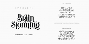
In serif fonts, the letters have extra strokes on the ends, are are considered to evoke a more formal, classic mood; sans serif fonts have no strokes, and are viewed as more casual and minimalist. (This Say It For You blog has always used the Arial sans serif font, which many consider ideal for digital content.)
Brands often use different fonts for different products. Coca-Cola, I learned years ago, chose different fonts for its Coca-Cola, Diet Coke and Coke Zero products. For us content writers for hire, the font we use should match the image projected on the client’s website. If the site is more traditional, we may want to use a more traditional serif font. If the client seems to project a more hip, modern look, the online content might be best presented in a sans serif font.
Serif or sans serif, Font size counts in cars and content marketing!


Leave a Reply
Want to join the discussion?Feel free to contribute!