Make Them See What You Mean – Put the Right Pictures With the Right Words
(Guest co-author: David Kale with imagery from Kale Design, Inc.)
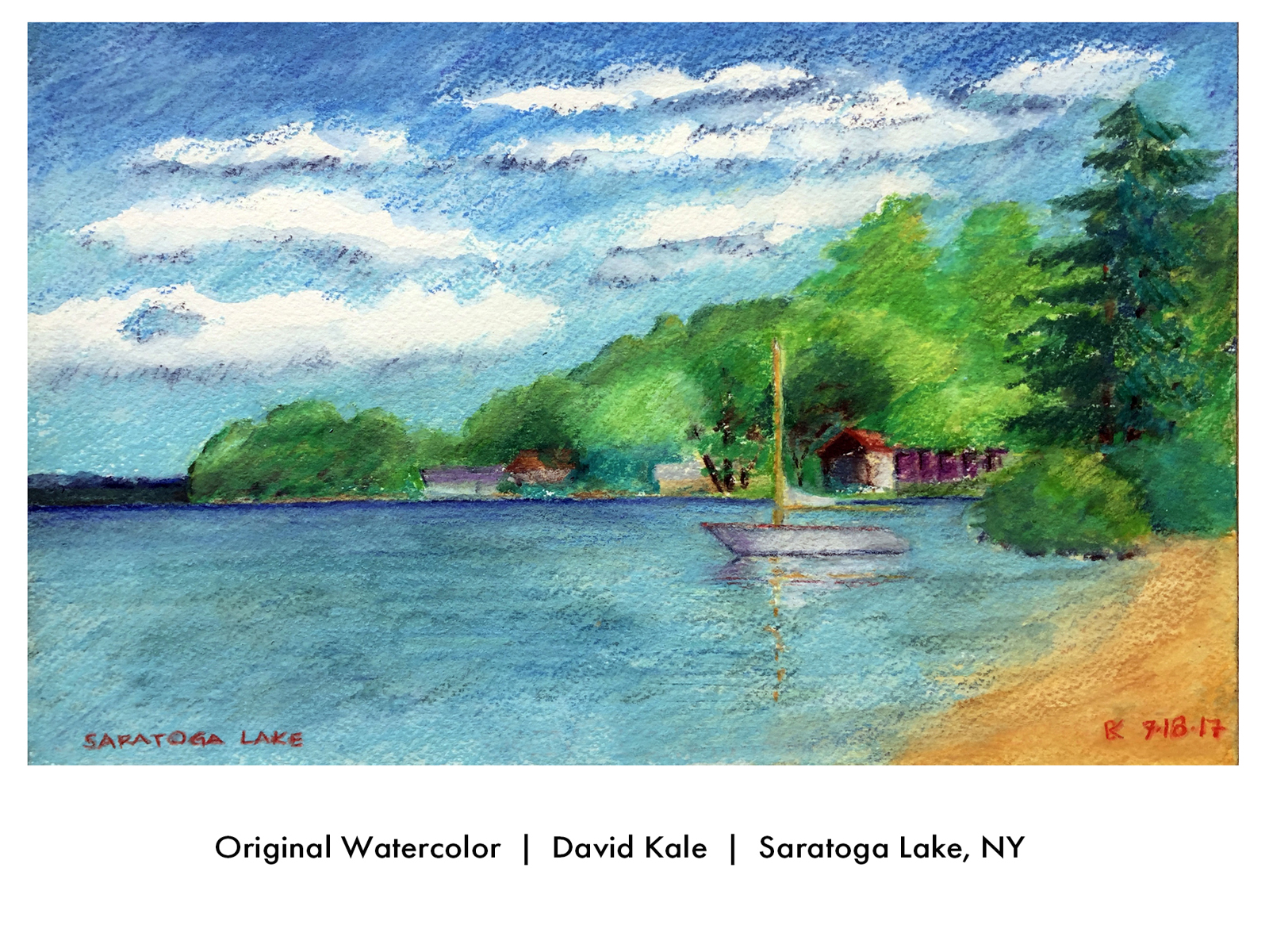
 David’s passion for creating fine art is grounded in his belief that every single mark on the canvas matters. Abstract or realistic, for a piece of artwork to communicate successfully, it must embody three key principles:
- Graphic impact: (focusing attention and hitting the viewer “between the eyes”)
- Design sensibility: (making sure the design utilizes all the medium has to offer)
- Totality: (delivering the message so that it holds together in and of itself, as well as with the other assets)
When artwork (photos, graphics, and illustrations) is used in advertising and marketing communications, these parameters become even more critical, since today’s viewers are bombarded with so many different stimuli.
While the content we create for our Say It For You clients is presented in the form of words, we know that the more closely the images accompanying the text combine to affect the audience’s hearts and minds, the better chance our clients will have of making their enterprise stand out relative to its competitors.
Kale elaborates on this effect: “When the intended message of an image harmonizes with the keywords in the headline and text of a a blog/article, website, video, advertisement, brochure, postcard, video, or trade show display), there is a better chance of engaging the audience’s attention not merely for moments, but of connecting with them on a much deeper level.”
Just as is true for artwork, to communicate successfully, content must aim to embody those same key principles:
IMPACT
At Say It For You, we prefer “I-you” (first person to second person pronouns) writing because of its power to create impact, revealing the personality of the “I’ behind the posts, ready to serve “you” (the reader).
SENSIBILITY
At its best, a blog post will demonstrate a uniquely sensitive approach to the needs and concerns of searchers, showing that those very needs and concerns are what has motivated the owner or practitioners to make their product or service more user-friendly..
TOTALITY
When it comes to blogging, we at Say It For You firmly believe in “the Power of One”, with one core message delivered in each post. The content must be focused on one audience, with one desired (and well-defined) outcome.
At Say It For You, we agree with David Kale’s maxim: Great words and wonderful pictures love to “dance together” — from conception to completion!
David Kale, founder and owner of Kale Design, Inc. helps businesses and entrepreneurs with creative thinking for their branding marketing, advertising, website graphic, printing, and trade show design.


 subscribers, followers, and leads, wouldn’t you do it every single time?” asks
Follow us online!